FIVE-ON-FRIDAYS: an Interview with Jeffry Weisman / Adorno
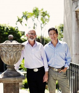
Jeffry Weisman and partner Andrew Fisher of the San Francisco-based Fisher Weisman have innovative, unexpected designs with rich, saturated color. Jeffry shares their take on classical design for modern, comfortable living.
Q. Tell us how the collaboration with Andrew started? How do your different strengths work together?
A. Andrew and I came into this thing with different perspectives. Andrew worked with Tony Duquette for 20 years; his first degree is in metal-working and jewelry design, and his second is in sculpture, so he has this artist/jeweler’s perspective on creating extraordinary, three-dimensional decorative objects. I came from an architectural background and spent many years working in the licensing of products to high-end manufacturers, so I have experience making products in a more traditional way.
The combination is actually great for our team. The highly decorated objects have to stand out in a rhythm where your eyes can rests between them. It’s helpful that we can design more architectural pieces that serve as the background foundation of a room, then have the jewel-like things that really give the room some punch.
We look at every project in terms of how to make something special for the person who lives there. More specifically, we consider how to make a place that far exceeds their expectations in terms of how beautiful it is, how well it lives and how versatile it is. It has to respond to who they are, where they live, how they live, how they entertain, what the climate is and what age the various people in the household are. It has to be a living, breathing thing that changes with them.
Q. As more and more products become available online, design services sometimes come into question. Can you give us your thoughts on design vs. shopping? Are people differentiating the two?
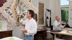
A. A lot of designers go to showrooms, find things in catalogs and assemble them, and there’s a lot of value in that. However, designers continue to add the most value in actually creating unique things. We love to make furniture, chandeliers and intriguing, one-of-a-kind items that are perfect for the client and how they live.
The designers who love what we love are actually going to be in a stronger position to have a better value proposition for high-end clients. We are going to make things that you can’t buy somewhere else, that don’t exist somewhere else. They’re going to be extraordinary and unique, and they’re going to speak to clients.
Most clients still really value strong conceptual designs and they don’t believe that they have the skills to create that for their house. Simultaneously, the extraordinary amount of product that is available for retail has also sown the seeds of questioning the value of execution. Clients may not be able to lay out the room or figure the color schemes or even find all the appropriate sources, but they begin to question how much they are willing to pay you to order things they think they can get themselves.
What we’ve always found to be the sexiest and most alluring part of this business is making custom items that don’t come from catalogs or showrooms. If we’re making a fantasy chandelier for your dining room, then there is no question that it is a one-of-a-kind, handmade item that your friends won’t see anywhere else. It’s a great way to add value to this business as it’s evolving.
Q. We recently saw your vacation house in San Miguel de Allende, Mexico featured in Michele Keith’s new book, Designers Abroad: Inside the Vacation Homes of Top Decorators. Your home is really lovely. Does the style reflect your personal taste or was your design mission to reflect the vacation mindset?
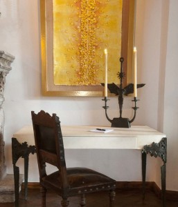
A. It reflects our personal tastes. What we loved about it was the combination of a beautifully located 18th-century building and an incredible lot with amazing trees. It was essentially a blank slate because it was built as a tannery, not a house. Everything that was in it when we bought it was brand new and ugly, so we felt no guilt about erasing it all and starting over.
The idea was that we were going to go to the house a couple times of year for vacation. While we were in San Miguel, we got hired to do some interior projects. We never thought of or planned on it, but it has actually been great fun working there.
We now live half the year in Mexico and half the year in San Francisco; we travel extensively all the time. We enjoy seeing what craftsmen can make in different parts of the world and the materials they use. Nature throughout the world is a huge inspiration for us and we love working with people whose final product shows their hand, so it doesn’t feel machine-made.
Q. Your projects elegantly blend different cultural elements. Rooms appear glamorous and formal, but they also have an inviting, international feel, which is a rare combination. How do you design homes that are upscale, yet also warm and comfortable?
A. Andrew and I are very much inspired by classical designs and symmetry. We have a strong appreciation for history, yet we don’t want to create something that aches of old design. We don’t want to make a museum or create a room that’s a reproduction of a period space, so what has enriched us is a very inventive combination of items that are hopefully unexpected together.
It’s true that our personal tastes tend to the more formal, dressier design. Even our country house and our house in Mexico are more formal in comparison to the houses in that area, but to us they are still perfectly casual.
That doesn’t mean we do only that for clients… We’re strong believers in walking that fine line between making something beautiful and childproof. It doesn’t make sense to us to make a house that is completely kid-friendly at the price of all beauty.
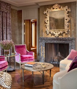
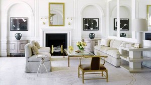
Q. You have such amazingly saturated, rich colors in your work. What colors and textures do you gravitate towards?
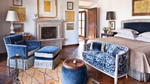
A. We have a couple of colors that we absolutely love and I find they vary a lot by context. In very urban environments, we go with platinums and silvers. We love dark chocolate brown, coral and chartreuse, so that’s one direction that we tend to work in. We love blue, but I will say we use it more in the country than in the city. We love purple—hate the word “purple”—but there are so many shades that we work with.
There is no color that can’t be fantastic in some context. I remember while I was in design school, that subject came up in color theory class. I would always think that color was contextual and the appeal varies from one context to another. There were certain combinations that I was certain I’d never like, but as I get older, I’ve found it’s just not true. It’s all about the shade of the color, what it’s being used for, where it’s being used and with what material.
In terms of texture, linen velvet is something that we use in almost every house. To us, it’s just the right combination of softness and luxury, without being fussy since it doesn’t have any shine to it. When you consider textures, the biggest challenge is to look at the whole palette, see how textures work together and what the combinations of those textures can build. You can have a favorite texture like velvet or suede, but by itself, that doesn’t make a room or a scheme. The combination of things is what makes texture work. As your eyes scan a room, they move both visually and tactically from one piece of furniture to the next. It’s the layering and subtle combination of textures that makes it… or breaks it.
Interview by Sara Ledterman
