With more than 45 years in the design trade between them, Andrew Fisher and Jeffry Weisman have decorated many prize San Francisco apartments over the years. So, within seconds, they could see the potential written all over their new clients’ recently acquired penthouse in a blue-chip building in Pacific Heights. The spacious floor-through duplex has superb light, with windows overlooking Lafayette Park and silver expanses of the bay to the north and south. “It is a fantastic property, very private, very quiet,” Weisman says.
The penthouse had undergone several transformations since its construction in the late 1920s, including a recent reworking by local architect Andrew Skurman, perhaps the finest purveyor of classical residential architecture in the city.
Skurman’s contributions included archways and new windows to infuse the 12-room apartment with a new grandeur.

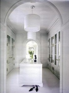
 Having worked on several apartments in the same building, Weisman and Fisher were thrilled at how Skurman had reconfigured the space, resolving many awkward aspects of The original design. Hallways that seemed too long and confusing before are now skillfully paced, says Fisher. Four bedrooms became two, with ample bathrooms and dressing areas. Both husband and wife now have spectacular offices.
“For casual or formal entertaining, the public spaces work flawlessly,” Fisher adds. “And all the details that Skurman devised feel bold and exciting.” But when it came to decor, the previous owners had a penchant for elaborate Florentine froufrou, including overwrought plaster moldings, vivid marble fireplaces, and faux finishes and textures. The entry foyer was dark and ponderous, “like a law firm library,” Weisman says.
The new owners have more modern taste. “Our goal was decor that was soft-spoken and a bit formal,” says Weisman, who grew up in Los Angeles and earned an MBA from Stanford.
“We wanted it to feel airy, with rooms that were contemporary in mood.” Fisher and Weisman had several discussions with their clients about stripping the detailing to the bare minimum.
In the end, the designers took a more judicious approach, removing a series of heavy brown Corinthian columns in the foyer and erasing some plasterwork that felt dated, then painting every wall, ceiling, and doorway a pale french vanilla (Benjamin Moore’s “Acadia White”). This new skin of matte white paint created a subtle play of light and shadow. “Suddenly, the rooms became a rich but low-key background for a collection of modern art and furniture,” says Fisher, who has a degree from California College of the Arts.
 The designers also introduced subtle color: a soft dove gray in the bedroom and dressing rooms, natural linen tones in the wife’s office, pale taupe and stained oak in the husband’s library, a deep taupe in the media room upstairs.
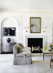
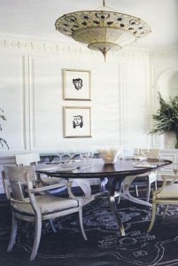
“Without this layering of tones,” Weisman says, “the effect would fall flat.” Today, hand-scraped and waxed parquet de Versailles in quarter-sawn oak adds a rich luster to the entry foyer and the grand enfilade of the hall gallery, which is lined with Matisse prints. In the living room, a new pale limestone mantel has replaced the old one of multicolored marble, its simple bull-nose curves bringing a sense of control to the room. A palette of ivory, taupe, and tobacco restores an air of order and calm. In the dining room, Fisher and Weisman selected a series of “White” chairs by Michael Taylor Designs. Painted ivory, in a curved design reminiscent of Klismos chairs in ancient Greece, they add a graceful, modern note.
Many of the pieces in the apartment are custom-designed by Fisher and Weisman or others. “We try to limit the amount of showroom furniture that goes into a project, so that it doesn’t look too familiar or expected,” Weisman says. The designers’ combination of grand, classical architecture and an elegant yet spare décor is fresh, distinctive, and vital—the perfect background for city life.
